
Hyphenova's Design System
Creating a Dynamic 72-Component Library with Responsive, Scalable Design
Role
UX Lead, Design System
Duration
3 Months, July '24 to Sep '24
Location
Los Angeles, California
(Remote)
Tools
Figma & Flutterflow
due to critical design misalignments leading to considerable inefficiencies.
Native developers faced substantial setbacks in building components and screens

I proposed implementing Design Systems to streamline product development, which led to me spearheading the project.

Overcoming Challenges
Variations in typography, colors and styles
Inconsistencies in Visual Language

Component Modularity Issues
Inconsistent spacing, undefined atomic elements & no autolayout

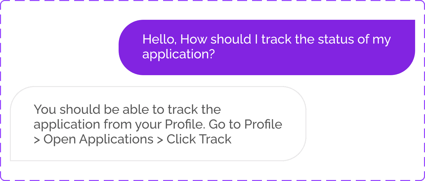
Ambiguity & confusion when referring figma + flutterflow
Lack of Guidelines & Documentation

Final Outcome
Development time reduced immensely
Previous time
~2 Weeks
Reduced by
~4-5 Days
67 %
2 rounds of Indirect User Interviews with 20+ creators provided valuable feedback on improving component spacing and colors.
Increased User Likeability and Satisfaction
73 %


Figma Library of 72-Responsive Components, its Variations & Icons
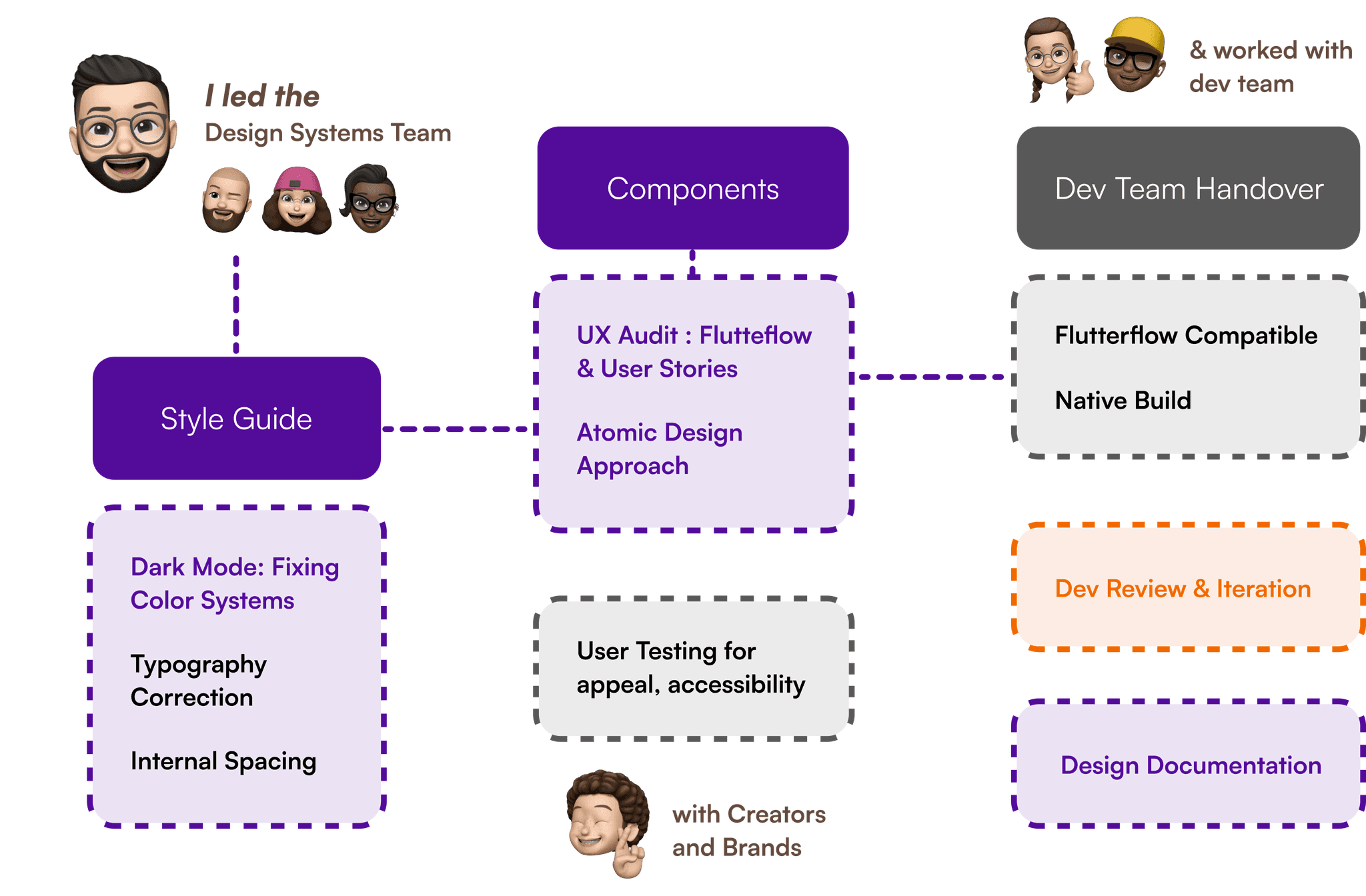
How was it achieved ?
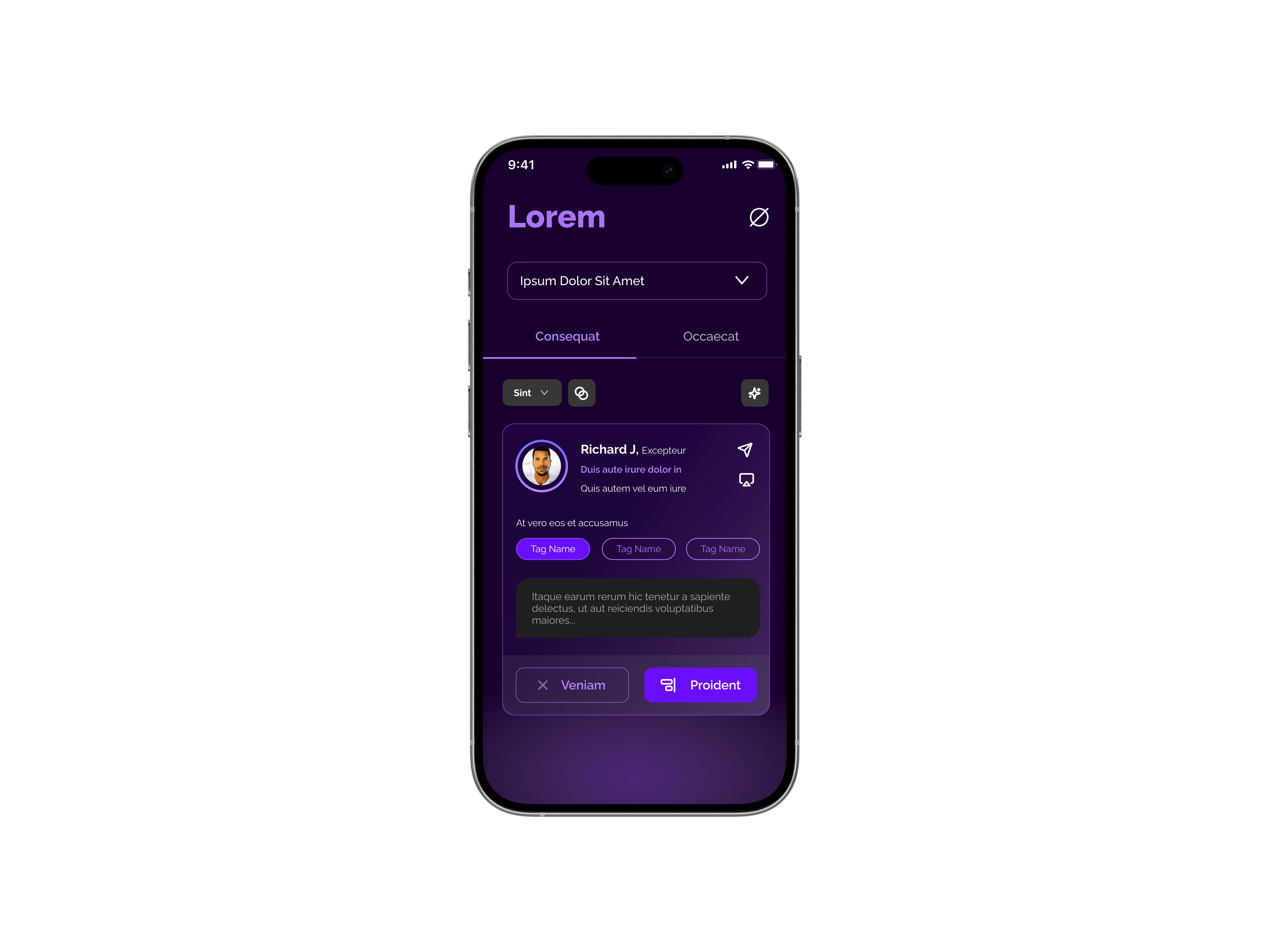
Given our time constraints and team size, we prioritized creating dark mode for V1, establishing a cohesive color system that would scale across future iterations.
1
Multiple Variations
Inconsistent Experience
2
Was a Problem
Time Constraints, Resources
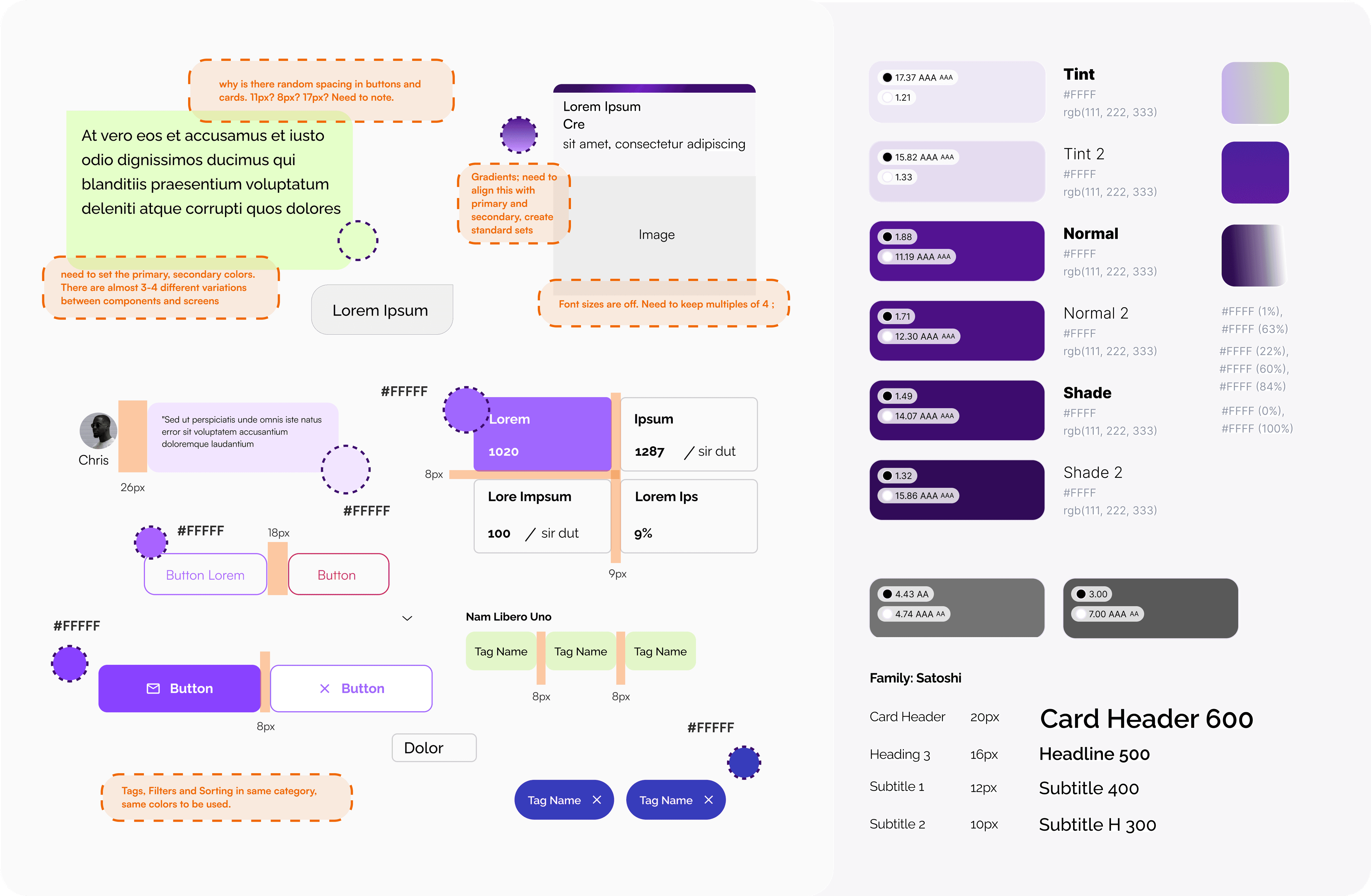
Fixing the Style Guide Established the Foundations for Consistency.
1
Auditing existing screens & components from Flutterflow
2
Documented Recurring Patterns, Areas of Standardisation
3
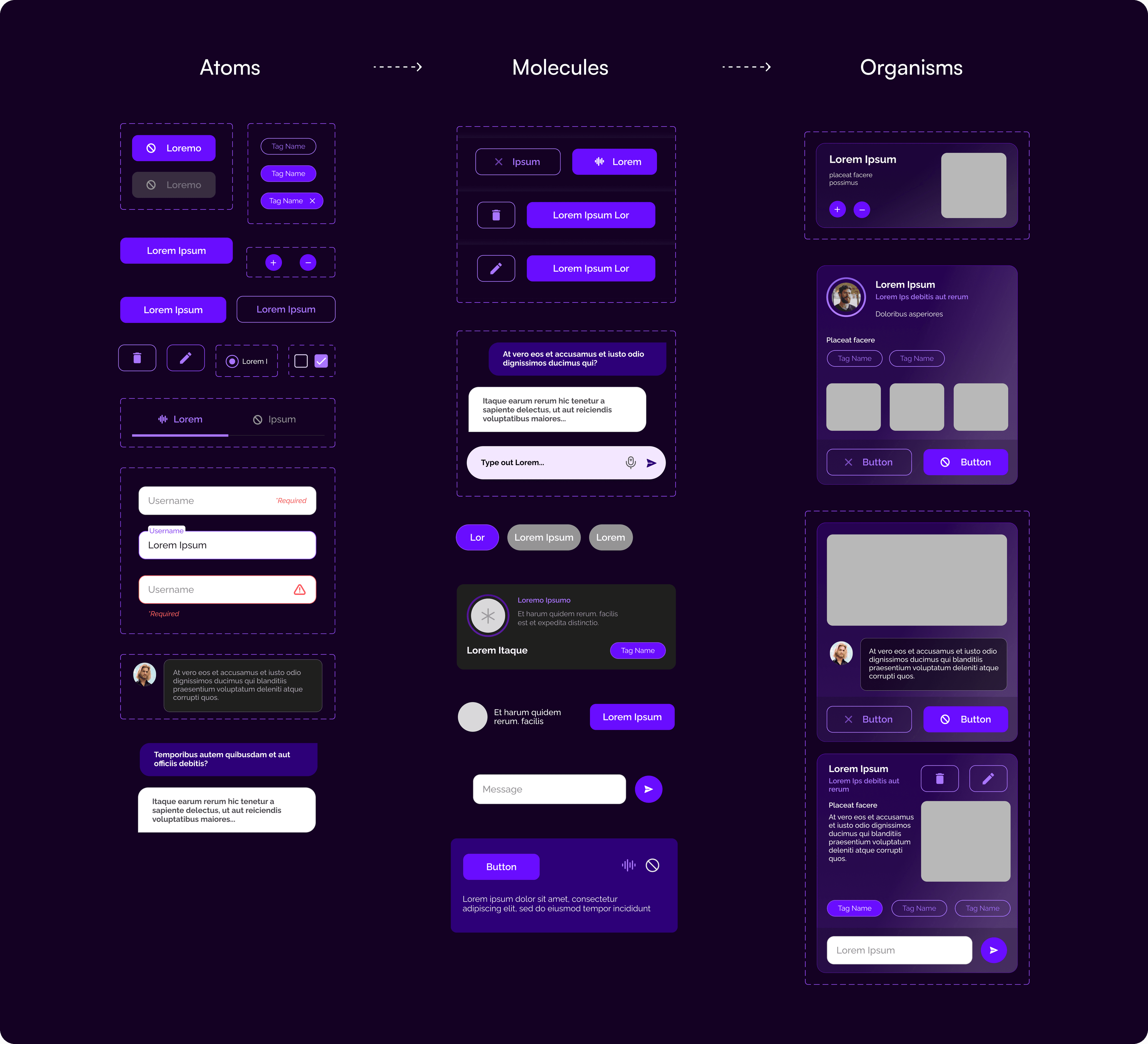
Breakdown to basic elements for hierarchy & reusability
To ensure that this consistency extended to the structure of the components, Atomic Design approach was adapted.
1
Significantly reduced the time for design iterations
2
Improved the handoff process to the UX & Dev
3
Modularity set groundwork for future expansions
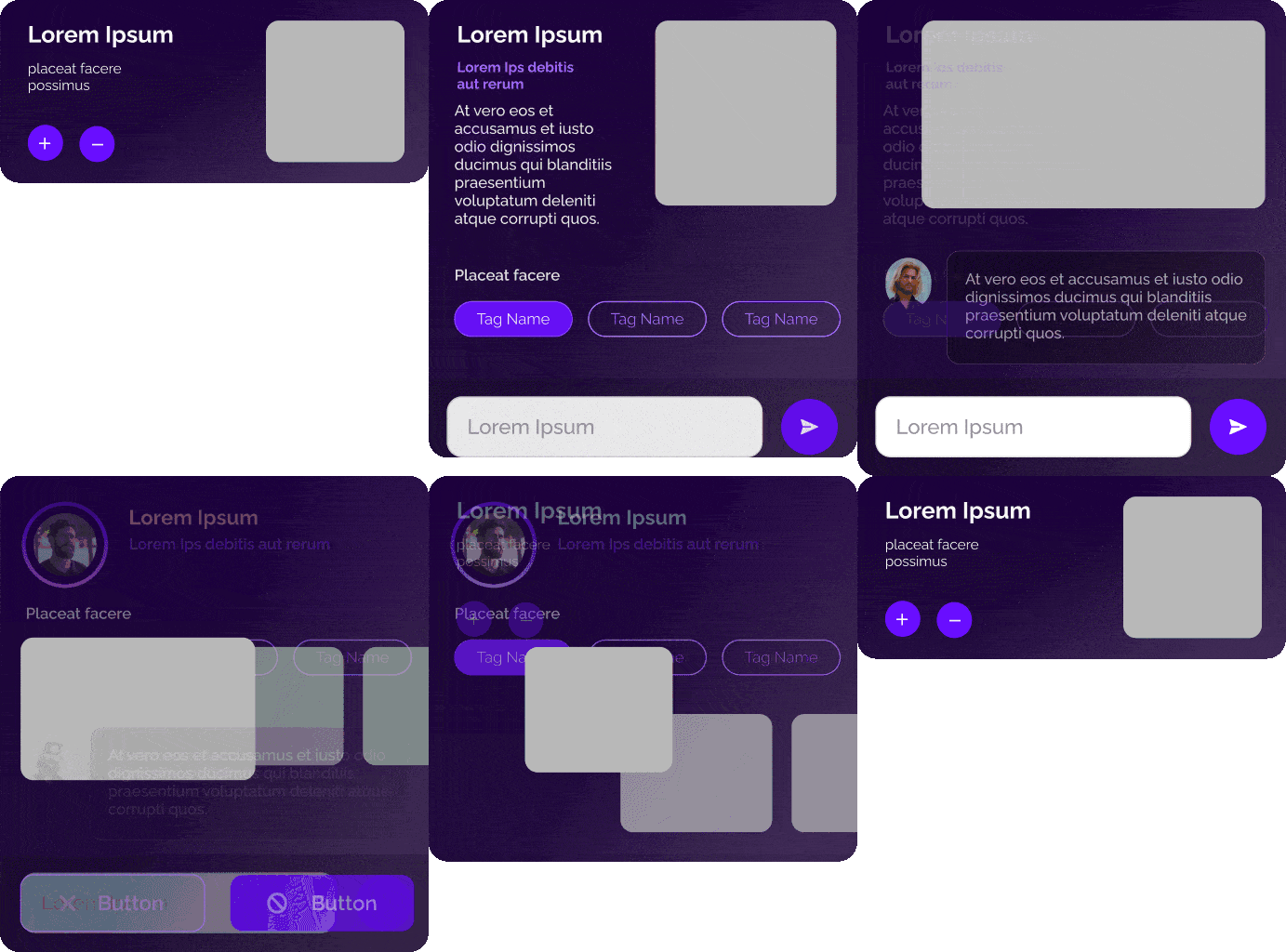
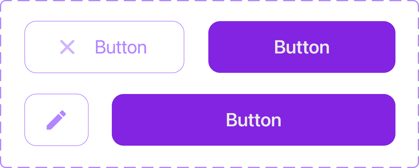
Many screens were heavily focused on card components, and a quick way to adapt these components with new requirements was autolayouting.
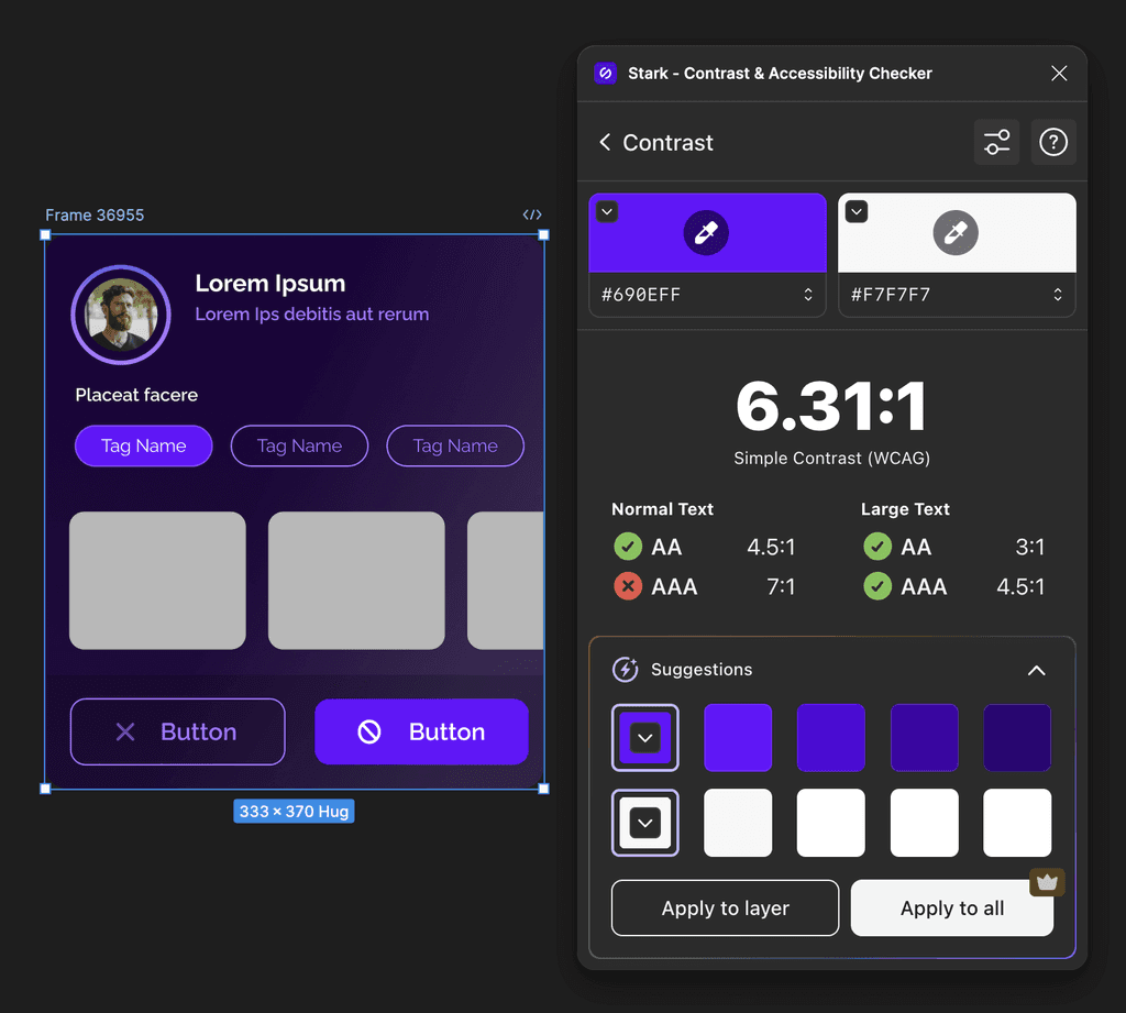
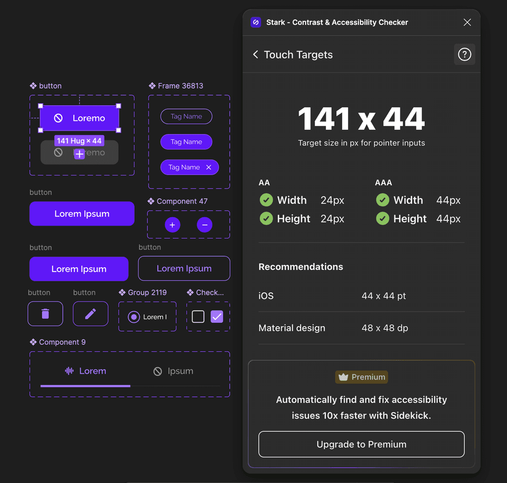
Accessibility was not an afterthought in this project—it was a priority from the very beginning.
Color Contrast: WCAG (Minimum AA)
Touch Target Standardisation
Reflections
Leading a team in a rapidly evolving startup environment
Given our time constraints and team size, we prioritized creating dark mode for V1, establishing a cohesive color system that would scale across future iterations.
I learned the importance of agility and adaptability in a fast-paced startup.
Coordinating with other teams and ensuring my team worked well together were key.
I focused on helping them understand priorities, promoting open discussions, fostering a positive environment, and making sure they felt valued.
Dealing with complexities & interdependencies
I learned how to prioritize workflows while managing the complexities of designing for multiple platforms.
This experience helped me put forward and lead decisions effectively, navigating interdependent challenges and ensuring the team stayed on track.
I also gained a deeper understanding of how to balance short-term goals with long-term scalability.
🚦
